Have you ever thought of comparing data categories? A radial bar chart offers the most straightforward way of comparing different data categories in a raw format. One of the things that makes a radial bar chart an ideal option for comparing data is the fact that it is easy to read and interpret. It works similar to a typical bar chart, although it has circular bars.
Besides, the essential components of good storytelling are easy-to-read and interpret content and the use of the right data visualization tool to present information. When you want to tell a data story to your audience, it is crucial to choose the best visualization tool, such as a radial bar chart.
In addition, visualizing your data in a radial bar chart in Excel is not overwhelming since it only calls for a couple of clicks, and you have the job done. Sometimes, you might get lost across the procedures when using Excel since there is something that you might miss that will make the entire work time-consuming.
When working on a radial bar chart in Excel, you can supercharge the process and make your work easier by installing an add-on with additional features vital during data visualization. Do you know the name of the add-on? Read this blog post for more information pertaining to a radial bar chart.
What is a Radial Bar Chart?
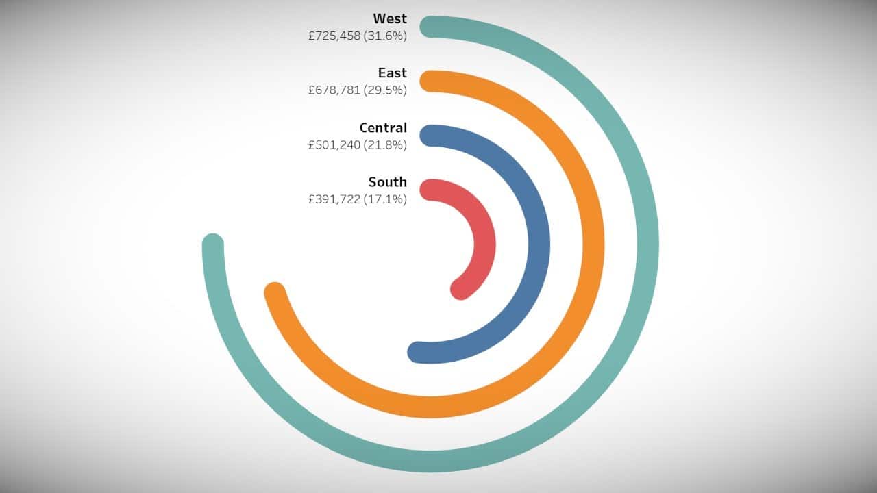
A radial bar chart refers to a unique version of a bar visualization plotted within a polar coordinate manner instead of a Cartesian plane. Note that interpreting this chart type is similar to the bar visualization designs. Similar to any other type of bar graph, the circular bars within a radial bar chart refer to the possible changes within your data variables.
The size of the circular bars refers to the magnitude of change within the variables. When the bar appears short, it represents a relatively smaller change in the variable. On the other hand, longer bars represent a considerable change in the metrics under analysis.
The Best Data Visualisation Tool to Create a Radial Bar Chart
There are multiple data visualization tools that you can use when visualizing your data in a radial bar chart. However, you need to be keen on your choice since not all the tools will serve you appropriately. Microsoft Excel is one of the tools to acquire and present your data in a radial chart without experiencing any challenges.
The reason why many people choose Excel over other tools is very open since it is the most common and trustable option. Besides, this tool has been in existence for more than a decade. Excel comes with a friendly interface that makes the work of data professionals easier since they have everything at their disposal.
However, generating a radial bar chart in Excel is a daunting task since Excel does not have templates for a radial chart that you can customize and use for your data visualization needs. Contrary, customizing the available templates to suit your data needs is time-consuming, and you can end up with a blunt visual.
You don’t have to spend a better part of the day struggling to create a radial bar chart in Excel since a simple solution can make the process straightforward. You only need to download and install ChartExpo, which will serve as a third-party app. What is ChartExpo? ChartExpo is a third-party add-in that comes with a readily made radial bar chart.
Once you download ChartExpo, you don’t need to be equipped with coding and programming skills since the add-in comes with ready-made options. You need a basic understanding of data visualization to run the Excel add-in without any complexity.
Why Choose ChartExpo?
This add-in comes with more than fifty ready-made charts that you can use in data visualization. Besides, ChartExpo is hosted on the cloud, making it light and easily accessible. After you download and install the add-in, you are guaranteed that your Microsoft Excel won’t be slowed down or affect its performance.
In addition, when you are done with creating the radial bar chart, you can export it in different formats such as PNG and JPEG. These are some of the most popular formats used to share photos across the globe. Also, ChartExpo has a seven-day free trial, giving you the freedom to opt-out of the tool if you are not satisfied.
How to Access ChartExpo
Once you have downloaded and installed ChartExpo, you can only access it via Microsoft Excel. Open the Excel application on your desktop, open the worksheet, and click on the insert button. Here, you will access the “My apps” option and explore the my apps button. Explore the options from the drop-down menu where the ChartExpo add-in is also listed.
Select the ChartExpo add-in and select the insert option. Note that if this is the first time you log in, it is likely to request the login details, although it won’t request the logins the next time you want to use it. Once you manage to log in, you will find out a list of options, including the radial bar chart.
Creating a Radial Bar Chart in Excel
There are two ways of creating a radial chart in Excel. You can opt to use a radial bar chart maker or ChartExpo. Collect your data keenly and export it to Excel. Highlight the data and press the insert button from the main selection menu at the top of your worksheet. Select the ChartExpo button and browse through the displayed options.
Click on the radial bar chart option and select the create button. A radial bar chart will appear on the screen with all your data arranged in a presentable manner. In addition, you can click on the “edit button,” which gives you a chance to make changes to the visual to make it more appealing.
In Conclusion
When comparing insights from data, the best tool to use is a radial bar chart. The chart gives you a clear view of in-depth data insights that can be used in decision-making and impact business growth. If you aim to save time and get high-quality visuals, consider using Excel and ChartExpo.
Paul is an content marketing strategist and serial entrepreneur.